Melbourne Airport
Building a modern website for Melbourne Airport to reflect the city.
Year
2023
Role
Product Design, Research
Opportunity
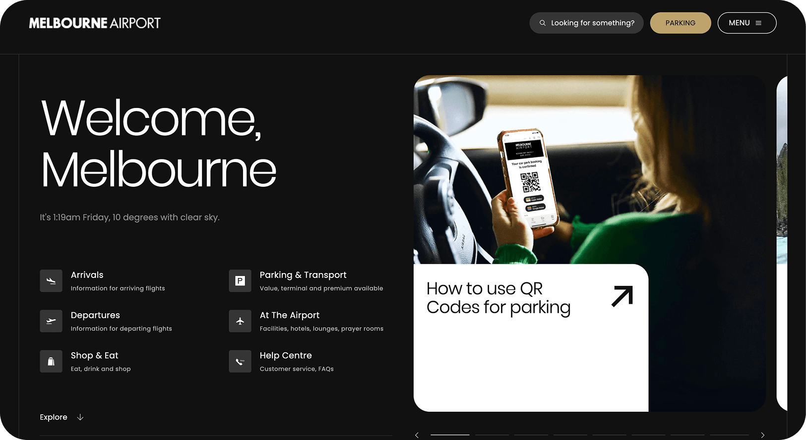
In 2022, Melbourne Airport undertook its biggest update in a decade. The site was critical: 30 million passengers and 200,000 flights a year relied on it for wayfinding, bookings, and essential travel information.
The existing website was clunky. Users had to dig for information, parking products weren’t clear, and booking flows were dated. The brief was ambitious: create a website that reflects Melbourne’s character while meeting global traveller expectations.
This meant rethinking core experiences like booking parking, checking flights, and finding services on-site. We needed to deliver intuitive flows, reliable search, and fresh product discovery - all while serving locals, international visitors, and airline staff with equal clarity.
Impact
W3 Award Winner 2023 – Website Features: Best User Interface
W3 Award Winner 2023 – Website Features: Best Structure and Navigation
W3 Award Winner 2023 – General Website: Transportation
AGDA 2023 Merit Award – Website Design
AGDA 2023 Merit Award – UX, Interface & Navigation for Websites & Digital Design
My Role
I worked as the UX Strategist. My role spanned vision and roadmap creation, feature prioritisation, customer research, information architecture, product briefs, wireframes, content, and usability testing.
I partnered closely with design, airport operations, and external dev teams. I led research with passengers and staff, and shaped the digital experience to align with Melbourne’s brand promise.
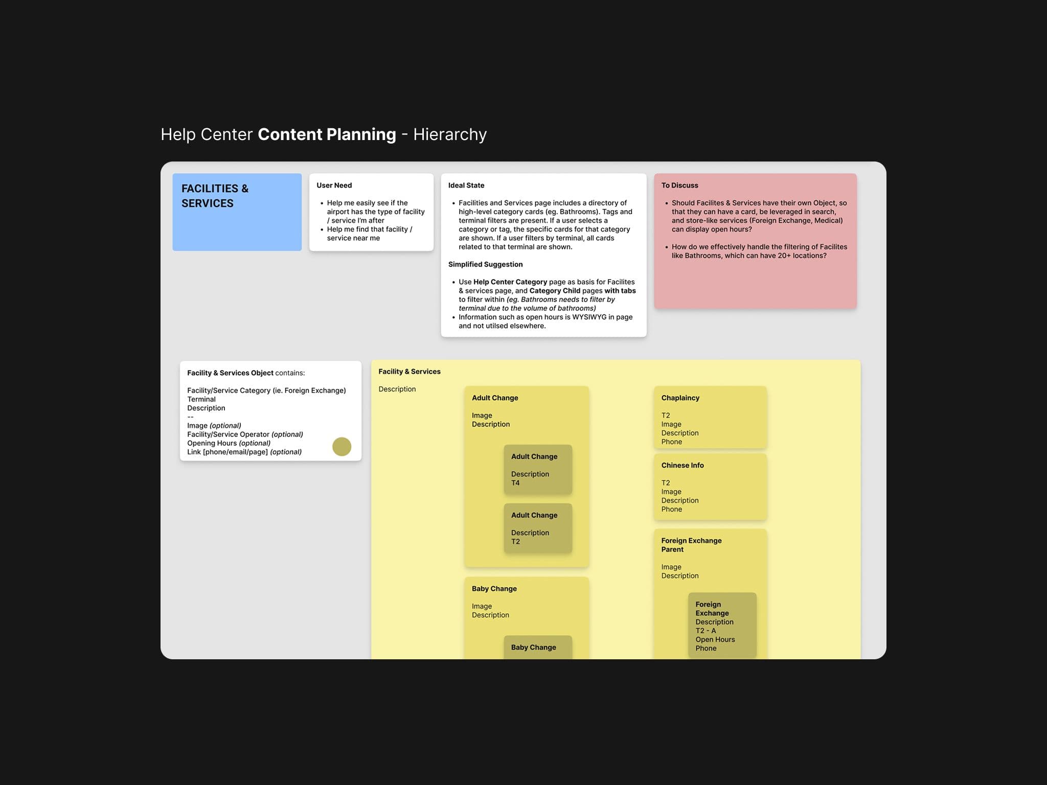
Help center content hierarchy required an overhaul of the existing items and many new topics
Approach / Process
1. Defining Scope and Personas
We co-created the project vision and roadmap with stakeholders across operations, marketing, and IT. I mapped traveller personas, from frequent flyers to first-time visitors, and prioritised their needs accordingly. We couldn’t solve every use case in a single rebuild, so we focused on parking, flight discovery, and content (help + shopping) surfacing as the core experience pillars to get right.
2. Information Architecture & Tree Testing
Early in the research we found the help centre and site navigation needed clarity. We ran current site exploration sessions with the core audiences, and then explored new ways to surface and group information. Findings showed different expectations for help content - older travellers expected structured FAQs, while younger ones searched directly for keywords. Given the heightened emotional state at airports, it was vital that audiences could find information in the way most intuitive to them. We used both quantitative averages and qualitative insights to restructure the IA so that this was accomplished.
3. Designing New Features
Key experiences were redesigned:
- •A smarter 'book parking' widget, balancing conversion with simplicity.
- •Revamped parking product cards with filters and tags for clarity.
- •Pin My Flight, letting users save a flight and receive contextual updates as they browsed to reduce anxiety.
- •Cross-domain search (traveller, community, corporate) with contextual recommendations based on store/service opening hours.
4. Usability Testing & Refinement
Wireframes and interactive prototypes were tested with airport staff and passengers. We refined microcopy, error states, and flows based on observed friction - one time, we even modified a core flow due to unintended traversing. A form of live usability testing was used at the end of each sprint and kept the experience intuitive without overcomplicating the backend build by back-loading the testing.
Learnings / Reflections
1. Strong POVs vs endless testing
Not all tests gave clear answers. For the booking widget, we ran multiple rounds (A/B tests, surveys) on vertical vs horizontal scroll and AM/PM vs 24-hour time. Results stayed inconclusive. I naively thought we'd find an answer through more testing, but learned that sometimes there is no answer. “Good enough” can be the best way to launch. Having a strong point of view here would have been the best way to go.
2. Many ways in
The site design broke category convention (brutalist inspired), and in many cases people had to learn how to use it. Tree testing showed that different age groups searched differently for the same content. What made sense to me and the team often didn't translate to the diverse audiences. Data forced us to step back and design an IA that worked for all, not just one assumed “average” user. We did this by allowing many ways in to the same piece of content - for instance, to get to the "T4 Toilets" information you could: search, click on the card, go through the header menu, find it on the T4 flights page, etc. Utilising a headless CMS enabled us this freedom of customisation and full-site surfacing.