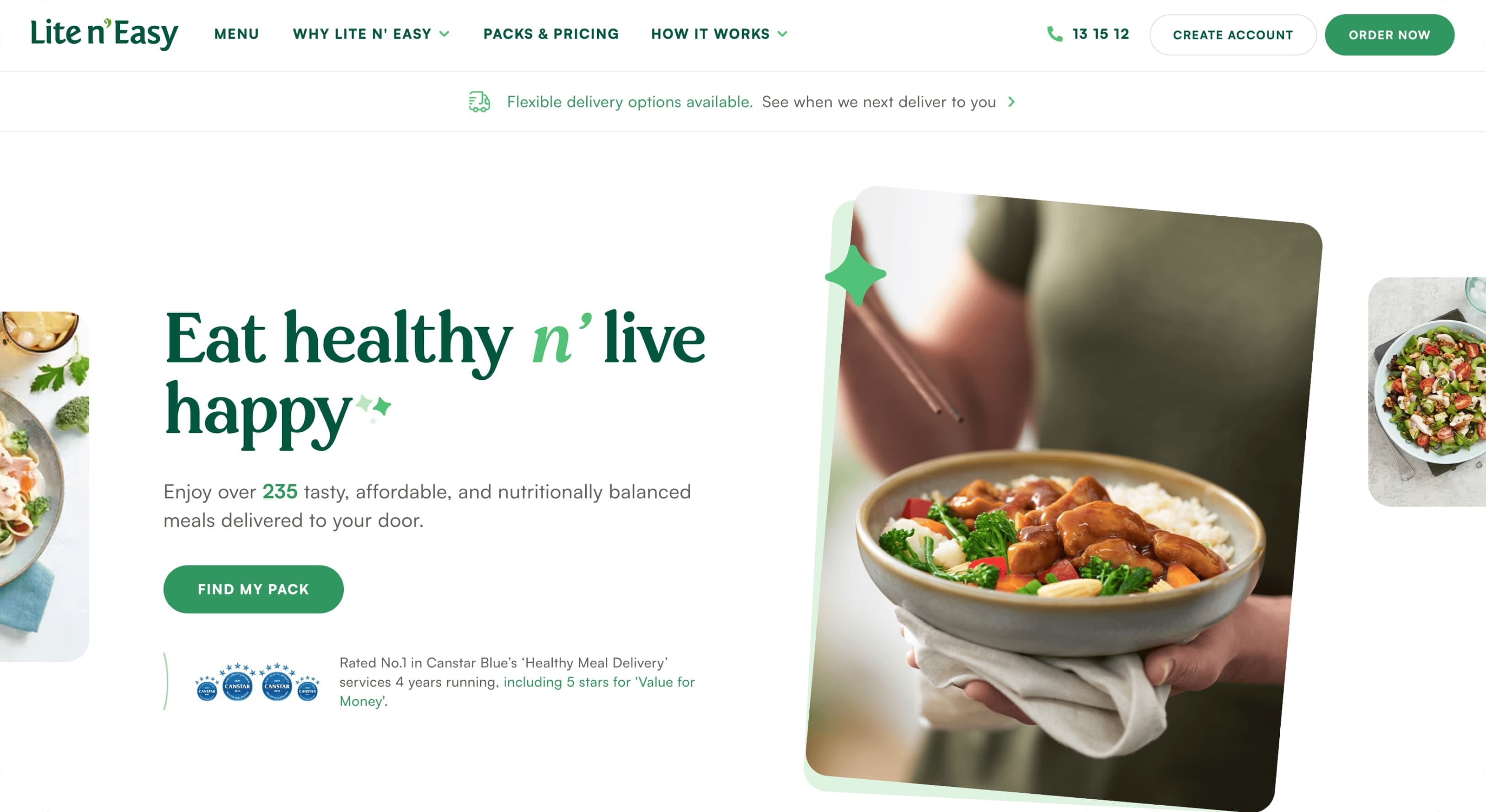
Lite n' Easy
From bloated UX to an easy, breezy, award-winning shopping experience.
Year
2023
Role
Product Manager, Research
Opportunity
Lite n’ Easy is an Australian icon, known for helping hundreds of thousands of Aussies lose weight and stay healthy. But by 2022, its website was stuck in the early 2000s. The sitemap was bloated. Product structures were confusing. Navigation felt like it was designed for the business, not the customer.
The stakes were big. Lite n’ Easy attracts over a million monthly visitors. At the same time, a major TV campaign and full rebrand were due to launch during the AFL Grand Final - the biggest TV event in the country.
We needed to reimagine the core buying journey: from exploration, needs identification, through to checkout. Food needed to be the hero. Choice had to be simpler. The entire experience needed to feel, well… lite and easy.
Impact
W3 Award Winner 2023 — Website Features: Best User Experience
W3 Award Winner 2023 — Website: Food & Beverage
My Role
I worked as the UX Strategist across the website launch. I defined the project vision and scope, co-created roadmaps, and prioritised feature sets. I led customer research, analytical reviews, and usability testing. I also developed product briefs, wireframes, and the plan matrix behind new packages and recommendations.
I was joined at the hip with design, development and branding teams to ensure decisions aligned across the board.
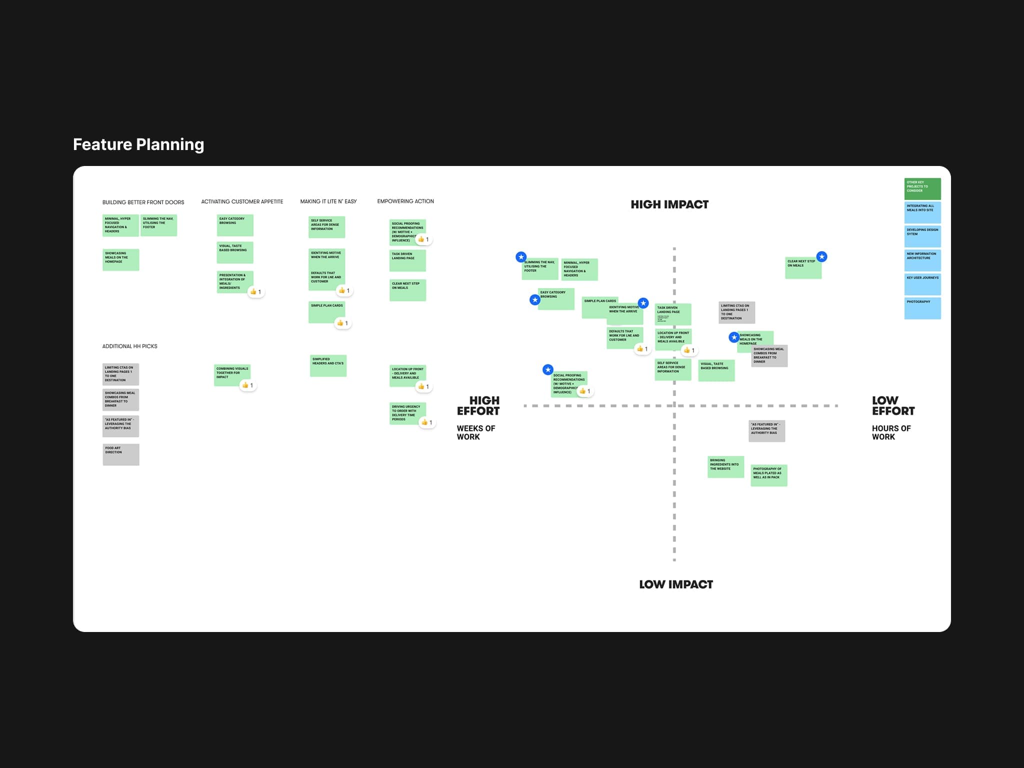
Mapping which features should take priority given our user needs
Approach / Process
1. Untangling product complexity
Lite n’ Easy’s product catalogue was dense. Calorie counts, program types, splits of days, type of meal. Customers felt like they were buying a house off the plan. It was overwhelming. I restructured offerings into a reduced set of clear packages with simple language (e.g. "1500 cal" becomes "Regular"; "1200 cal" becomes "Lite"). This drastically simplified the product table and made the recommender logic workable.
2. Grounding decisions in personas
We built robust personas early and used them as touchstones. Every design, label, and piece of content was checked against these core audiences. Personas and the name you give them (e.g. Active Annie) work to shortcut understanding within the team, speeding up all movements from first concept to interaction design. They stopped us drifting back into business-first thinking over the course of a 9 month project with many moving parts.
3. Redesigning product cards
This was the core conversion point. We tested three design directions, then iterated heavily on the winner. At launch, cards were interactive, accessible, and readable, working in tandem with their checkout. We combined qualitative testing with quantitative heatmaps to capture a full picture of how people actually used them so we were informed with the CRO tests to pipeline.
4. Compressing the sitemap
The legacy sitemap had 300+ pages, most of them irrelevant. Navigation was overwhelming, and SEO value was limited. I pulled the structure back to four core headings with funnel paths. We used redirects and content migration to retain SEO value, while ensuring every page nudged people back to a browsable, buyable flow.
5. Building personalisation and proof
People on the weight loss/fitness journey want to see results from others. We introduced personalised recommendations and dynamic social proof at key points in the journey (product pages, plan recommender, 'how it works' etc.). These responded to customer profiles in real time, creating reassurance and urgency to get started (or keep going).
Learnings / Reflections
Packages beat permutations
Reducing endless product configurations to a small set of packages unlocked everything - simpler tables, a usable recommender, and faster decisions for customers. Previously, customers may feel they understand what to purchase during checkout by reading page copy or a product matrix. With this change, we could surface actual products throughout the journey to actually purchase. A small but mighty reframe (with a lot of spreadsheet behind it).
Navigation is an experience in itself
The sitemap reduction was a mix of content and UX strategy. It's not easy to convince a client to reduce all of the content they've ever produced, but by having nuanced data down to the page-level, I could make the case for its simplification. By collapsing 300+ pages into four intuitive sections for further exploration, we made the site easier to use and kept SEO value intact.
Qual + quant is non-negotiable
Heatmaps showed the scale of issues, while usability sessions gave us the why. Running both meant we made design calls with confidence at the end of every sprint. If you can do it, do it.